Saturday, 7 May 2011
Wednesday, 4 May 2011
Monday, 28 March 2011
Evaluation: 1. In what ways does your media product use, develop or challenge forms and conventions of real media products?
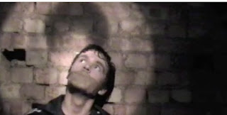
Genre: Above is a scene from a movie called 'Reservoir Dogs' showing a torture scene, where the protagonist has tied someone up, so they can be tortured. Within my movie production revenge was a central theme, therefore the conventional torture scene that is sometimes used in the action thriller genre. This was also used in A Changed Man. I believe through using this type of scene i can clearly show the vengeance that the character wants and this gives the audience reassurance of what genre this movie is. Through the product i have convinced myself that through shots such as the one above, i have successfully conveyed the action thriller genre. Action is successfully shown as the chase scene depicts this showing the action part of the action thriller, as where the torture scene shows the thriller side of the genre.
Costume: Above you can see a a clip from the movie 'unknown; starring Liam Neeson. As we can see he is wearing a black t-shirt along with a black leather jacket. This modern clothing enables the protagonist to suit all environments within this action thriller. This makes him look as if he is an average person, however connotation's of the colour black show the protagonist is serious and mysterious thus reinforcing the genre and the themes used throughout the movie. As we can see from a picture above of my trailer, the protagonist is also wearing black in most parts. As he is used in dark lighting, the connotations of black such as mystery and fear start to arise as looking at a dark figure on a dark street suggests that whoever this protagonist is looking for should be afraid. I believe by choosing this costume it has enabled me to aid the revengeful theme and also make the protagonist more memorable to the audience therefore the audience can relate this character to the other products within the promotional package.
High Pace: Within a teaser trailer and especially those of the action-thriller genre, pace is a very important attribute as it will enhance the thrill your target audience will get out of watching it. Using appropriate music along with short clips of scenes that are sometimes shocking and engage the audience to think what happens next has enabled me to produce a high paced trailer therefore making the trailer more enjoyable and luring the audience to come and see the movie itself.
Non Linear Narrative: Teaser trailers are not created to tell the story as that way the audience would already know what's going to happen when walking in to the cinema. However taking scenes out of chronological order and then shortening them with fade in and out effects, gives the audience a taster of what they are going to see but do not know how it will start nor end. I believe by using clips i have recorded and taking them out of their sequential order, i have created a successful non linear narrative thus not giving any story away but merely tempting the audience to want to see the movie.
Length: Teaser trailers are conventionally short as the aim is to briefly inform the audience of this upcoming movie and lure them in to seeing it. Teaser trailers tend to be under a minute long but some can go as short as 30 seconds, showing how brief the display is but successfully engaging with the target audiences mind. My teaser trailer is 55 seconds long, so as a result i have successfully created a teaser trailer that is short but includes many scenes and high pace to fascinate the target audience.
Captions: Captions are placed in to a trailer to feed the audience a better understanding of what is going on or they are intrigued by the various statements that are made. Captions can cause breaks between shots therefore it gives the effect of increasing tension within the target audience thus resulting them getting more of a thrill out of the trailer. The font colours, size and style suits the production as they look professional and clear. The colour red that is used has a connotation of blood and as this is a teaser trailer based around revenge, blood seems to further enhance this theme.
Representation: Above are two shot's of how the protagonist is represented. As we can see in the first picture, the protagonist is being hit around the head with a baseball bat, showing a possible burglary gone wrong but due to the use of captions we find out this is not the case, it is in fact a murder. This set's up one storyline. The next picture shows a different representation of the protagonist as a man who is on some sort of quest for vengeance. As we can see he is holding a gun and walking towards something or someone. This strengthens the representation that he is truly 'A Changed Man' as we can see the comparison of him in his home as a normal man but then becoming dark and revenge driven it clearly shows how the two story lines are set up but how it ends is not revealed. Not revealing how it ends, is a common technique as it attracts the target audience to go and see the film.
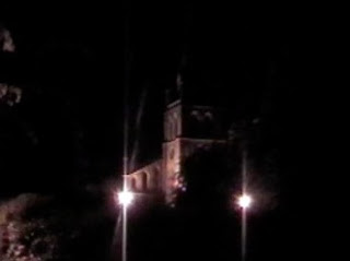
Location: Above we can see that various locations have been used when filming my trailer. I wanted to display urban locations but also blend them in to uncommon locations. By showing locations in the background of scenes i was able to successfully show the urban setting. Locations such as a darkly lit street with a church in the background, the hallway of a house, a grimy torture location and the inside of a church all display the vast range of locations that were used. As most of these locations are dark, it compliments the theme and genre of 'A Changed Man' as it is a story of revenge.
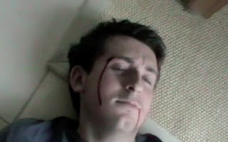
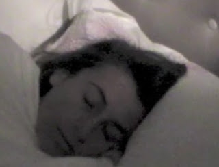
Charachters: As soon as the teaser trailer starts, we are introduced to the main protagonist. He is the used in most scene's. Also the other protagonist is introduced later on in the trailer being tortured. The female character appears in one scene sleeping. Through recognising who the charachters are, the target audience is able to relate to them in the rest of the promotional package, as they are also one of the main features of the production.
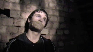
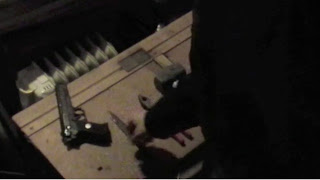
Editing: Above are pictures of editing tools that i used. Commonly used in productions is the fade in or fade out tool. Above are shots of a fade out used within my trailer and how it is faded back in to another shot. This creates a more polished transition instead of being a firm impact which does not look professional.
Overall my teaser trailer uses many forms and conventions as they have been used in the movie making industry for years and have been successful. To ignore the success of these movies and their trailers would be unwise as it clearly shows that these conventions are key when creating a successful product.

Location: Above we can see that various locations have been used when filming my trailer. I wanted to display urban locations but also blend them in to uncommon locations. By showing locations in the background of scenes i was able to successfully show the urban setting. Locations such as a darkly lit street with a church in the background, the hallway of a house, a grimy torture location and the inside of a church all display the vast range of locations that were used. As most of these locations are dark, it compliments the theme and genre of 'A Changed Man' as it is a story of revenge.


Charachters: As soon as the teaser trailer starts, we are introduced to the main protagonist. He is the used in most scene's. Also the other protagonist is introduced later on in the trailer being tortured. The female character appears in one scene sleeping. Through recognising who the charachters are, the target audience is able to relate to them in the rest of the promotional package, as they are also one of the main features of the production.


Editing: Above are pictures of editing tools that i used. Commonly used in productions is the fade in or fade out tool. Above are shots of a fade out used within my trailer and how it is faded back in to another shot. This creates a more polished transition instead of being a firm impact which does not look professional.
Overall my teaser trailer uses many forms and conventions as they have been used in the movie making industry for years and have been successful. To ignore the success of these movies and their trailers would be unwise as it clearly shows that these conventions are key when creating a successful product.
Sunday, 27 March 2011
Evaluation: 2. How effective is the combination of your main product and ancillary texts?
(Click to enlarge)
Above is a picture of different sections of the trailer and also the movie poster and magazine cover.
When researching how movie trailers were able to relate to movie poster and movie magazines in the view of an audience, themes was the biggest convention that stood out to me. As conventional teaser trailers are brief with a non linear narrative, i found that magazine covers and movie posters shared the same attempt to invoke the genre of the movie through various objects but not reveal the story.
The genre of 'A Changed Man' is an action thriller. As it is a story based on revenge i decided that it was best to use this theme on the movie poster and movie magazine as by use of images and colour i have been able to replicate this theme therefore combining the main product with the ancillary texts. By continuously using the colours of red, white and black throughout all three product i have able to relate them to each other. Through using the colour red, the connotations of blood produced by it would effectively compliment the genre and themes throughout the three products. Although using white had no effect in order to relate to any themes, it boldly stood out in front of the commonly used dark backgrounds so that it would increase the awareness amongst readers and the audience. Black is a colour often with the connotation of fearful, mystery and darkness. Also as a dark colour, it stands out against a much brighter colour such as red therefore it become more eye catching to the audience. The fonts are all a very rigid and sharp, therefore showing the seriousness of the film and sets it apart from being a film directed to a younger audience.
Another combination to show the relationship between the 3 products is the use of the protagonist's image. In the main product, which is the teaser trailer, the protagonist is often in the shot's, showing a great amount of reference to him as he is the star on the movie. In order to give all three products an image for the promotional package, using him was essential as when the audience saw him they would instantly be able to relate the teaser trailer, movie magazine and movie poster together without having to closely examine them. The expression and appearance of the protagonist e.g. the blood running down his face incorporates themes and genre into it as using blood and a look of pain and vengeance immediately informs the audience what type on genre this is.
Although the movie magazine would of been produced by a different company to that of the movie poster and the trailer, i believe that i have assembled the magazine as it would of been through the styles of fonts, choices of colours and image that were used. Through researching various film magazines, i have noticed that the protagonists is always displayed, and i have replicated this, therefore i believe this is the best way for the audience to identify it with the rest of the promotional package.
Through creating similar styles and purposely sharing themes, the target audience should easily be able to recognise they are related. I believe that through these similarities between the products i have successfully integrated them well therefore the promotional package as a whole is very effective.
Saturday, 26 March 2011
Evaluation: 3. What have you learnt from your audience feedback?
Trailer
Most of the feedback seemed positive as people liked the way in which they could feel the tension generated from the music and how it worked well with the shots. Also most of the feedback mentioned, not revealing the story which shows i have successfully created a teaser trailer as it's purpose is to show a non linear narrative and give the audience a taster. Also people recognised the genre of an action-thriller and the themes such as revenge and fear. This proves that i have successfully reached the audience and provided a suitable genre that can be recognised by all.
However negative comments included possibly adding sound effects and making caption font's bigger. Although i had a fixed idea of what i wanted, to create a more professional product, listening to your audience can be the best way of doing this even if it means changing that fixed idea.
Magazine
(Click to enlarge)
Above are comments of various students who have seen all 3 products and made comments about the magazine. They are talking about what they liked and what could be done to improve the magazine cover. It seemed that most people liked the way the protagonist was staring straight the reader as if to "intimidate" them. This help's intrude the reader's mind that this is a story of revenge and that whoever the protagonist is after should be afraid. Other positive comments talked about how you could relate all 3 products in the promotional package through using the protagonists image in all. Also the colours stood out very well against the background therefore making it more eye catching for the reader.
Also some criticismmade was about the use of colours. Eloise Galloway suggested that different colours could of possibly been used in order to mix it up a bit. Although her point was noted down, i felt that by mixing more colours in to it, the colours wouldn't compliment the action thriller genre nor would they stand out as well. Also it wouldn't look as stylish and could look unprofessional.
Poster
(Click to enlarge)
Above are comments of various students who have seen all 3 products and made comments about the poster. Most of the feedback was positive and people seemed to greatly appreciate that it too out from a distance therefore it was eye catching and easy to read. Image, tile and caption were the main objects mentioned. I see that this as a success of the design as by looking at title, images and caption you are able to gain the name of the movie, a feel of the genre, themes of revenge and fear through facial expressions and also the caption about revenge back's up the audiences suspicion that this is an action-thriller about revenge. This is a great advantage as i am able to directly aim at my target audience using the poster alone.
The only criticism made was the the background colour could be changed to create a more attractive poster. Although the background of the poster is just one colour, i believe this colour best suits the fonts and images as they stand out very well. Using a darker background colour, would prevent the audience from seeing the objects on the poster as well as they could if it was lighter. i also chose against a light colour as it does not enhance the theme of vengeance and fear, therefore this dark grey colour was best suited to the poster.
After all these comments were made and reviewed, i found it hard to change the fixed ideas i had but believed it to be best if i listened to the audience as they are the people judging it therefore if they like something better, you should adjust it so it suit's the target audience even more.
Friday, 25 March 2011
Evaluation: 4. What have you learnt about technologies from the process of constructing this product?
Above is a photo showing the various technologies i used in order for me to produce my products. Below i have explained how each technology benefited me and what i learnt about them.
1. IMac: This is the computer that i used in order to create, edit and produce my trailer, magazine and poster. Through it's very user friendly interface, using the various pieces of software on it, i was able to edit my products efficiently and professionally. It worked smoothly with all digital technologies that were connected to it. Another reason why it was selected, is because it already contained many pieces of software in order to complete my task. Without having access to the many resources on the IMac such as the internet, research into magazines, posters and trailers could have not have been conducted nor could analysing another student's work in order for me to better my own. Also if the IMac was not available to me, i would not of been able to create the trailer, poster and magazine in the time frame that i was set. This piece of technology has given me the ability to create professional looking product's which otherwise could not of been produced to this high standard.
2. IMovie: The way in which IMovie made use of a very user friendly interface, enabled me to use the software without having to do extensive practice. As it came as a part of the IMac, the software was freely available and i was very surprised that such a high quality piece of software such as IMovie would be available to me. It had many features which worked efficiently and no errors or viruses occurred therefore not resulting in any loss of work. Also the way it immediately opened when a camcorder was connected to the computer, and then asked what clips you would like to add made the job of importing clips simplistic therefore showing how easy digital technology integrated with one another. Features such as cutting clips, adding music, adjusting exposure, contrast or saturation and fading in or out shots through transitions were made available and very easy to use, clearly showing how digital technology such as this has such a big impact on professional looking products. IMovie is very efficient when tackling tasks such as this and without it i believe i would of created more amateur looking products and it would of taken a far larger time scale to complete.
3. Nikon D60 SLR: Using the Nikon D60 digital camera was extremely useful when taking photos for the poster and magazine as after each shot i was able to review the photo i had taken using the LCD screen and decide whether it was worth keeping or not. This technology also incorporated a zoom feature, allowing me to take close up's or pictures from a distance which was used for effect purposes. Also as it was light and compact for the high quality shot's it was taking, it was highly portable and could be used in any environment. As it used digital technology there was no need to buy film rolls as each photo was stored on to a memory card were it could be deleted or stored as where on a film roll, once the picture is taken it cannot be deleted. Another important feature that i learned of when using the D60 was that it was compatible with every photo software i used on the IMac and transferred the photos without any problems of e.g. format.
4. Blogger: Blogger is the very software that i used to explain, display and document the progress of creating, editing and producing my products. To show the reader of mistakes made while editing or filming, blogger enabled me to upload images and scans of faults to give evidence to my explanations. Embedding other video clips of e.g. rough filming, teaser trailers or directing was a function available that seamlessly integrated the use of video clips on to the blog. When conducting research in to magazines, posters, trailers, genres etc, i was able to use the Link function which allows me to incorporate website links, so that the reader is also able to view the source of my research. If blogger wasn't available for my write up i would of used a word processing or a slideshow software, which would of been much more time consuming as repeatedly saving the writeup and producing print out's would of been inefficient. However Blogger includes an autosave function, which greatly improves the chance of retaining your work if it was lost or deleted. However the biggest opportunity it has given me, is the ability to publish my work to a wide audience of people as anyone can access it through the internet, and being able to review other people's work. Through this capability i was able to look at other blogs e.g. http://getaheadocrmedia.blogspot.com/ and find out how to further enhance my own, which has greatly benefited me.
5. Google: Google is a search engine, giving me access to a wide variety of resources all over the internet from all over the world. Researching review websites and sites such as http://www.youtube.com/ has given me a much deeper insight in how trailers, magazines and posters are developed, constructed and published. The search engine is very fast as it takes less then a second to come up with millions of results. Through searching for conventions of teaser trailers, film magazines, film posters or action-thrillers, i was able to learn about them and incorporate them into my own products. It gives you a better understanding of how these types of media are produced therefore you are able to create higher quality products
6. Panasonic SDR-S50: The way in which the camcorder operated with it's replay function on the LCD screen, was extremely helpful as i was able to make sure i got the correct scene i wanted after filming therefore not having to go back and re-do the scene. The camcorder was very small, compact and light therefore making it highly portable, so it could be used in all positions and environments. Also as it had contained an optical zoom, i was able to shoot scenes from a further distance for effect purposes. As it used a memory card, data could be deleted or transferred on to a computer through it's built in USB port. Because of all these features, digital technology within the camcorder has enabled me to review and make decisions instantly on what i have filmed.
7. Photoshop CS5: Photoshop is a specially developed software for editing pictures. As it was made available to me, i took full advantage of it so i could use it's various features to enhance my pictures. When wanting to cut an actor within the production out of a picture and place him on to a different background to improve the impact of the product. Without features such as the magic wand tool or text tool i would not of been able to produce a professional looking poster or magazine, therefore it was a crucial piece of technology.
8. Tripod: This tool is extremely useful when wanting stable shots of all angles. This piece of equipment reduces distorted recordings caused by shaky hands or vibrations therefore giving the recording or photo a clear and more focused look. It also enabled both the camera and camcorder to fit ideally on to it, therefore it did not fall off or become loose.
9. IPhoto: Also like photoshop, this software enabled me to use it's features in order to create a more professional picture by affecting aspects such as brightness, exposure, contrasts, saturation and temperatures of the picture. Also like photoshop i was able to crop photo's so that the picture had a more focused area. The reason i adjusted pictures with this software, is because of it's user friendly interface. As it was simplistic yet effective i found it ideal to edit the look's of the picture. However when wanting to accomplish more difficult task's such as background removal or adding of text in different fonts, photoshop was the more ideal choice. When a camera source was plugged into the computer, the IPhoto software immediately recognised it and automatically opened. Once opened is asked me whether i want to import all photo's to it's gallery or only photo's i select. This again shows how efficient and compatible digital technology is when it comes together.
10. Sony Bloggie MHS-TS10: This piece of technology, although not used often was very useful when taking pictures of me directing or needing to film directing. It is a handheld device, making it highly portable and contains full HD recording. As it is highly portable it could be used at all times therefore when an idea came to mind i could record it. However the most intriguing part of the Bloggie, is the way it connected to a computer. It has a built in USB, so you can plug it directly into a computer for transferring the data. The device was recognised by all video and photo editing software, and within second's its data would be transferred on to the computer, ready for editing.
The most important learning that has come out of this process is that through digital technology most people can now simply record, review and edit on the go. This therefore creates much more user generated media that can be loaded directly on to the computer. Also the way in which all digital devices can connect to each other without any issues fascinates me as everything is so much more efficient. It has also never been as easy to load it on to the internet and publish your own media so that it can be shared with everyone. This is a great ability as more objectives can be reached more efficiently and in a smaller time scale.
Thursday, 24 March 2011
Planning: Dimensions and Fonts
Poster
Poster Dimension = 420 x 297 mm or 16.5 x 11.7 inches
Font Colours: Black and Red
Font Styles: Book Antiqua 25pt/ 30pt faux italic/ 40 pt/ 140 pt faux bold, Calisto MT 20pt
Magazine
Magazine Dimension = 297 x 210 mm or 11.7 x 8.3 inches
Font colours = Red and White
Font styles: Copperplate gothic light 90pt/70pt, Adobe gothic STD 28pt faux bold, inaimathi 25pt, Times new roman 25pt, Courier new 20pt, Microsoft Sans serif 26pt, Myriad Pro 10pt, Book antiqua 18pt.
Trailer
Trailer Dimension = 640 x 360
FPS = 25
Font Colours: Red and White
Font Styles: Century 40 pt, Baskerville 78, Big Caslon 41.8
Wednesday, 23 March 2011
Feedback: Monday 21st
On the 21st of March we had a session where each student could review each others work. Crticial comments where made about different pieces of work therefore enabling us to improve on our work. Below are some of the comments made by students about my three products. I have taken them in to account and have adjusted the issues that have arisen.
"The yellow font on the magazine cover doesn't go well with the mostly red and white text, i think it should be taken off so that it creates a more professionally produced magazine"
"The font on the poster should be made a lot larger, as the current font doesn't really fill up the poster and therefore it cannot be seen from a distance"
"The white background on the movie poster should be changed to a darker cover, to compliment the darkness of this action thriller"
"Captions should be inserted into the trailer in order to create more suspense to the target audience"
"More edit effect's like fade in and fade out need to be used to ease transition between shots and create a more professional production"
After reviewing all of these comment made, i am inclined to agree, as when testing out all of the comments made on my actual products i could see myself a significant improvement in the effect that they would give to the target audience. Through enlarging my font on my poster and changing the background colour to dark grey, the reader of the poser is able to see the poster from a greater distance therefore it is more eye catching.
The yellow font was taken off the magazine cover, as it did look more stylish and professional when getting rid of the yellow as it did not suit the red and white text, nor the theme meant to be portrayed.
Fade in and fade out were used and it created a much more professional looking production as when reviewing professional trailers, i could see that this effect was used often. This also created more suspense and tension within the audience as it took slightly longer to see what happens next. Captions were also used as i found that it enticed the audience and persuaded them to want to know and find out more about 'A Changed Man'.
The feedback given to me has significantly improved my final products therefore creating a more professional looking promotional package.
Tuesday, 22 March 2011
Planning: Raw Footage, Evidence of Practicing Shots and Shot's That Were Not Used
Above is a video of me and another actor discussing how he should swing the bat and make it look like he is going to hit me properly. We discuss speeding the video up so it looks as if he is about to actually hit me with a full swing.
Above is a video of me and another actor discussing the timing when walking past the camera as leaving it too long will create a lengthy clip which cannot be used as a teaser trailer is meant to be short.
Above is me testing walking to the camera with a bright stained glass window behind me. I was conducting this test in the school environment and this is the reason for the loud background noise. This test gave me further ideas when using bright light to fade out the characters identity.
Monday, 21 March 2011
Teaser Trailer Editing
Below are a series of screenshots showing the process of my editing for my teaser trailer. Using IMovie has greatly benefited me as it gives me various tools to make a more professional looking trailer. Below there are screenshots of me selecting music for individual shots, entering effect between shots and editing more shots to put in my teaser trailer.
Sunday, 20 March 2011
Evidence of Practice Shots, Directing and Editing
Below are various shots in various locations, where i had been directing what we would do with individual scenes and how we would actually act them out. Myself and the actors each discussed how we were going to approach each shot before commencing the shoot.
Saturday, 19 March 2011
Planning: Health & Safety
Within any production health and safety is an important factor. The HSE ( health and safety within the entertainment industry) government website states the importance of this and how they are their to support anyone as a result of a injury. The website can be found here at http://www.hse.gov.uk/entertainment/ .
Within my trailer and poster i have various weapons on display. Below are a list of the weapons used and how precautions were taken to prevent any injuries of the actors.
Knife - Although the knife appears very real from the angle of the camera, the knife is in fact plastic which will cause no harm to anyone when it comes in contact with them. I also made sure before filming that the actors agreed to being in contact with this plastic knife so that they were comfortable with it.
Gun - The gun appears realistic as it is a metallic black all over, thus giving it the effect of a real gun. However the gun is a plastic gun and does not fire anything. The actors were reassured of this as they were able to review the prop and then they gave their permission for it to be used.
Blood - The fake blood used within the production was not harmful as the bottle of the fake blood i had bought, informed me and the actors that it was washable and non irritable to skin.
Outside (Public Locations) - The filming was done late at night in a local area, where it was late, so there was not many people around and this gave me an easy to work in environment.
Car Chase - Although this scene was not included, i had filmed a scene involving a car chase. The cars were traveling at the legal speed of 30 mph and were sped up using the video editing software. They were driving down a normal street road in a straight line with no manoeuvre's therefore not endangering anyone. The camera man was standing on the pavement so they were not near the cars.
Baseball Bat - Although it looks realistic, the bat is actually plastic therefore it can cause no harm when someone is hit with it. Also within the trailer, no one will be hit with it but editing effect will make it appears as if it does.
Friday, 18 March 2011
Planning: Music
Music is a key part of teaser trailers as it incorporates pace, intensity and improves conveying the genre of the trailer. Within many professional trailers, they create their own unique music that will help to enhance the trailer they have created. Although i wanted to use music from these trailers so that i would be able to enhance my own trailer, due to copyright, i took the option to find a copyright free source of music, so that i could use it within my trailer. Using www.mobygratis.com i was able to sign up and choose from a wide range of music. After requesting a license for a piece of music, i was able to download and use this music with the permission of it's creator. Here is the license agreement that the website has given in order for me to use it's music http://mobygratis.com/modules/gratis/license-agreement.pdf . Below is a screenshot of the license permission agreement mobygratis had sent me by email.
Thursday, 17 March 2011
Planning: Voiceover and Sound Effects
Although many trailers include voiceovers to tell more of the story, i felt that i would not include a voiceover within my trailer as it is a teaser therefore the aim is not to tell the story of movie but to entice the audience into wanting to see the movie. I felt that giving as little away as possible is the key when creating a teaser trailer, therefore instead of using voiceovers throughout my product, captions would be used to give a commentary on the trailer. The captions aid the trailer as it invites and tempts the audience in to wanting more, thus having to go and watch the movie for themselves.
When reviewing sound effects on various websites such as www.youtube.com or http://www.freesfx.co.uk/ or using software such as garageband for mac, i felt that i did not need any of these effects as there were no places within these clips i thought necessarily needed these effects in order to enhance them.
When reviewing sound effects on various websites such as www.youtube.com or http://www.freesfx.co.uk/ or using software such as garageband for mac, i felt that i did not need any of these effects as there were no places within these clips i thought necessarily needed these effects in order to enhance them.
Wednesday, 16 March 2011
Reflection: Editing And Filming
My filming commenced on friday 11th march according to schedule. I was able to film over 58 minutes and 38 seconds of footage over the following three days. This than gave me enough raw footage to edit in order for me to create my teaser trailer. Through using a the camcorder i was able to use a USB data lead in order to transfer the data to the computer in the correct format which would then load up in to my video editing software.
Editing took longer than first thought as there was a lot more raw footage to choose from. Also to make sure the story wasn't revealed completely within the teaser trailer, i followed the idea of non linear narrative so that the clips were not in a chronological order. When editing i also found that some of the clips needed to be re-shot as they were either too dark or not stable enough. I then re-shot the clips required on the following friday which was the 18th of march. I was able to complete the re-shooting and add them to my trailer.
Because of the digital technology available to me, i believe that this enabled me to produce my trailer in more efficient and professional way. The camcorder linked directly in to my computer and transferred all digital data into the video editing software. The software gave me a great advantage as there were many tools with which i could edit the recorded data such as cutting parts of the clips, stabilising the shots and adding music to them.
Tuesday, 15 March 2011
Planning: Filming And Editing Schedule
Filming will be shot over a 3 day period in which i aim for 2-6 scenes per day. Not all these scenes will be necessarily included in the trailer but recording extra scenes will give me a greater choice of what i put into the final teaser trailer. I have already organised a set date for friday march 11th which will give me the next 3 days with my 2 actors and myself. As a teaser trailer should show a non linear narrative i will not record the scenes in any particular order but i will wait until i have all recordings before editing starts. Below i have a screenshot of what scenes i need to film in order to complete my recordings.
I will need to leave myself plenty of time when editing the recorded data as i will film many minutes of film which will then need to be cut down so that it can successfully come together in a sequence of shots that will create a teaser trailer. To make a professional looking teaser trailer the audience shouldn't be focused on the editors skills but merely on the excitement of the trailer being shown. Through using a software for mac called IMovie, i will be able to edit my trailer using various tools that will give me the ability to make this recorded film in to a short sequence of shots therefore creating a teaser trailer. I believe editing will take up to a week with which i will add various items such as captions and cropping of clips. Editing will commence on Wednesday 16th March as all raw footage will be loaded on to IMovie and is expected to be done in the following 2 weeks.
Monday, 14 March 2011
Planning: Shooting Plan
Start
1. MPAA approval scene
2. Fade out/ Fade in
3. Close up of protagonist face
4. Fade out/ fade in
5. Europa Institution Shot
6.Fade out/ Fade in
7. Medium shot of knock out scene
8. Fade out/ Fade in
9. New line cinema institution shot
10. Fade out/ Fade in
11. Closeup of Female character in bed, being strangled
12. Fade out/ Fade in
13. Caption 'How far would you go'
14. Fade out/ Fade in
15. Medium shot of Protagonist walking down dark street with gun
16. Fade out/ Fade in
17. Long Shot Chase scene down street
18. Fade in/ Fade out
19. Medium shot Chased in to church scene
20. Fade out/Fade in
21. Caption: 'If someone hurt'
22. Fade out/ Fade in
23. Low angle medium shot walking towards camera in chapel shot
24. Fade out/ Fade in
25. Caption 'The one you loved'
26. Fade out/ Fade in
27. Medium shot of character tied up
28. Fade out/ Fade in
29. Closeup shot of weapons
30. Fade out/ Fade in
31. Medium shot character being tortured
32. Fade out/ Fade in
33. Caption 'Be Prepared'
34. Fade out/ Fade in
35. POV shot of character running in to the main character.
36. Fade out/ Fade in
37. Title 'A Changed Man'
38. Fade out/ Fade in
39. Caption 'Coming Soon'
40. Fade out
END
Friday, 21 January 2011
Planning: Props, Costumes & Locations
Props
Below is a list of props that will be used within the production of the teaser trailer.
- Gun
- Knife
- Hammer
- Pliers
- Baseball bat
Costumes
Male Characters: Main Character
Main: Black Tracksuit Bottoms, Black Coat, Black Shoes - T-shirt, Tracksuit Bottoms
Hair: Messy, unkept.
Male Character: 'Bad Guy'
Main: Tracksuit Bottoms, Baseball Hat, Tracksuit Jumper, Trainers - Black Tracksuit Bottoms, Black Long Sleeved Shirt
Hair: Messy, Unkept
Female Character: Victim
Main: T-shirt, tracksuit bottoms, socks
Hair: Untidy
After watching trailers of the same genre as the one i'm going to create, i have chosen the above costumes as they are typical everyday clothes. The dark outfit's used aid the themes of revenge and fear as when wearing them in low light scenes, it creates more intimidation. The costumes that the characters are in, i believe suits the situation the characters find themselves in. The male characters each have their own representations. The main character's outfit are ordinary everyday clothes but when placed in a dark environment, connotations of darkness and mystery start to arise as well as fear. 'Bad guy' has two outfits, one clearly showing him as a criminal and the other showing him in his casual clothes, that he wears in everyday life. The female character is represented in casual clothes that she would wear when relaxing at home.
Location
Wide shots that are used to represent the location in which the events are taking place, i believe although good in establishing the location, doing it too often will waste a few important seconds within the teaser trailer that could be used to show more action.
I will have many locations within the trailer for the events to take place in which are listed below:
- Hallway
- Attic
- Kitchen
- School Chapel
- Public street
- Outside Church
- Bedroom
Many of the settings are very small, enclosed and dark, reflecting the emotion of the main character once according to Todorov the equilibrium of the movie has become unstable. The darker events of the trailer are typically shown on the interior as they show emotions that character feels. The mise en scene within locations such as the hallway within a house shows the protagonist as a normal family man who quickly goes dark and becomes 'A Changed Man' when the equilibrium becomes unstable.
Thursday, 20 January 2011
Planning: Storyboard and Moodboard
My story is going to be based around the action-thriller genre and incorporating themes of revenge and fear. It is about an ordinary man who's life is changed due to the death of his loved one. As he becomes dark in himself, he wants revenge and therefore seeks to find those of murdered his loved one. Whether or not he finds them all or if he's tracked down is up to the audience to decide as they will have to go to the movie to find out.
Below is a mood board representing the themes and genre i want to use within my trailer. Through these image i believe i can successfully represent my aim.
Wednesday, 19 January 2011
Research: Audience
Primary Research
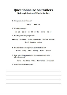
To further develop my understanding of what audiences i should aim the trailer at, i created a questionnaire that i handed out throughout my school and family. I gave it to 36 people and of an equal amount of males and females, so that the test results are fair and are not bias to one sex. The ages ranged from 15 to 45 therefore giving a wider range of results. Below is the questionnaire that i had given out.
Quantitative Results
Question 1

As you can see from the results above there were 50% male participants and 50% female participants. They consisted on 36 participants overall.
Question 2
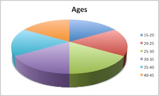
In the above pie chart you can see there is an equal amount of participants in each age section, therefore making the questionnaire more valid and less bias between ages.
Question 3
Overall
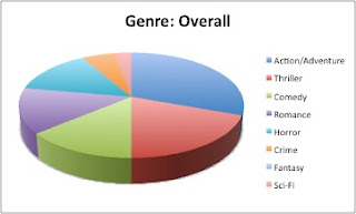
Overall it seemed that Action/Adventure was the most favoured between both sexes showing that the genre of the trailer I'm creating is favoured amongst the general audience of all ages.
Women most favoured the romance genre, with thriller and action/adventure following close behind.
Question 4

The evidence above shows that due to good trailers being advertised often convinces the public to go and watch the movies often. Showing how big an impact a trailer can make.
Question 5
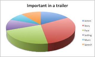
Above we can see that the audience find the storyline and pace in a trailer the most important assets with other attributes such as actors, speech, music and setting following behind.
From this quantitative research, it has affected the way in which i will produce my trailer. The pace was already something i had set in my goals to produced. An effective pace to create a climax throughout the trailer is key when wanting to draw the audience in.
The storyline also seems to be very important when producing a trailer. Showing a successful narrative seems to be key, because if there is no story to a trailer, then it gives the audience no motivation to see the movie. As we can see from question 4, a trailer is very important in contributing to people going to the cinema and watching the full length movie, so pace and narrative are the basis of the trailer i'm going to create.
Action/Adventure seemed to be the favoured genre of all movie genres amongst the people who answered the questionnaire, who represent the audience. A convention of action movies is high pace, so i must make sure that once the pace starts to get faster, it continuously does so throughout, until the end when it comes to a threatening scene which leaves the audience at a cliffhanger.
Tuesday, 18 January 2011
Research: Audience Profiling
Through conducting in depth reasearch, many organisations investigate specific details of what audience they want to attract through analysing there tastes such as music interests, sport interests, what age they may be, what was the last film they might of seen, what type of computer games they may play and what TV shows they are interested in.
Because my movie trailer is under the genre of action-thriller, i believe by using audience profiling i am able to get a much clearer view of what type of audience im trying to attract. Below i have created a profile for what a person would be like, who i would target for my movie.
Age: 18-23
Occupation: Student at University
Computer Game Interests: Shooters and FPS
Music Interest: Rock, Hip Hop
TV Show Interest: 24
Last film seen: Taken
Sports interest: Football, Rugby
Below is a picture of the person I am trying to target.
Monday, 17 January 2011
Research: Teaser Trailer Research
Teaser Trailer
The task is create a Teaser Trailer for a new movie, create a magazine front cover based on the movie and a poster for the movie.
A Teaser Trailer: A short trailer that is used to advertise an upcoming film to an audience. They contain short sequences in order to entice the audience to want to see the movie. They are also brief so that the release of this movie is made out to be a big important event.
Conventions are what we usually expect to see in all trailers. Common conventions are listed below.
Titles - These are shown so that the audience know what the film is called, and if the title is produced well within a teaser trailer with good fonts and attractive colours, these titles tend to linger in the audiences mind.
Voice-Over - This is a narrated, non diagetic sound that could represent the protagonist telling a brief outline of his story, or could be part of a scene within the movie itself.
Release date - This is shown so that audience know what time the movie is coming out, therefore bringing more excitement for the coming months towards the movie.
Music - Music is key when incorporating it in to a teaser trailer, as it can aid attributes of the trailer such as the high pace and storyline. The producers must make sure that the music is suitable for the genre of the trailer in order to assist it's effect on the audience. Music within the trailer is usually diagetic.
Pace - This can vary throughout the trailer, usually to stimulate and thrill the audience.
Institutional References - Companies that have produced and distributed the movie are shown to the audience in the trailer.
Below are examples of teaser trailers.
Conventions of teaser trailers include:
Titles - These are shown so that the audience know what the film is called, and if the title is produced well within a teaser trailer with good fonts and attractive colours, these titles tend to linger in the audiences mind.
Voice-Over - This is a narrated, non diagetic sound that could represent the protagonist telling a brief outline of his story, or could be part of a scene within the movie itself.
Release date - This is shown so that audience know what time the movie is coming out, therefore bringing more excitement for the coming months towards the movie.
Music - Music is key when incorporating it in to a teaser trailer, as it can aid attributes of the trailer such as the high pace and storyline. The producers must make sure that the music is suitable for the genre of the trailer in order to assist it's effect on the audience. Music within the trailer is usually diagetic.
Pace - This can vary throughout the trailer, usually to stimulate and thrill the audience.
Institutional References - Companies that have produced and distributed the movie are shown to the audience in the trailer.
Below are examples of teaser trailers.
Fast Five
Conventions of Fast Five:
- An institution is shown at the beginning of the trailer, showing the audience that the trailer has been approved for appropriate audiences by the MPAA.
- A wide shot of Rio De Janeiro is shown, establishing the location of the following events. A caption saying the location is also displayed.
- The pace starts off slow and as music is introduced it gradually gets louder as the pace becomes more intense.
- After the action starts, the institutions who produced the movie are displayed.
- Voiceovers used while others events are shown, so that the situation can be more fully understood by the audience.
- Instead of a date, the season Spring is displayed as the release time.
- Various title captions are used to excite the audience.
- Many conventions of the action genre are included such as car chase scenes, guns and explosions.
- Many cuts to different scenes very quickly in order to keep the pace fast.
- Movie information is displayed at the end of trailer such as the movie website, production company and where to see the movie.
Taken
Conventions of Taken:
- MPAA approval certificate is shown at beginning, to inform the audience they have legal consent to watch the trailer.
- Movie institutions are shown (20th century fox & Europa)
- Pace start off slow, and through different shots of an innocent daughter and gentle diagetic music the equilibrium starts off stable.
- Music dramatically changes signifying a change to the equilibrium.
- Two scenes are shown at the same time of a phone call, showing both fearful and nervous expressions of the father and daughters faces. This also helps the audience to understand the situation the protagonist finds himself in.
- Fast cuts to different scenes are used in order to create pace in this situation, giving the audience discomfort and tension.
- Diagetic music is again changed to give a sense of mystery of who is on the other end of the phone call.
- One scene is played with it's speech, whilst many flash forwards are quickly flickered in between this scene to show what action is to come.
- As the phone call is coming to an end a sinister piece of diagetic music starts and gets quicker, giving a sense of panic to the audience.
- All diagetic music is stopped, in order to give the dramatic effect of the response, which the person on the other end of the phone call says "good luck".
- Title of movie and director name are displayed whilst a hanging up tone is played, then another, gradually slower breathing sound is used as actors names, the release date and the movie website are all displayed to the audience.
- The hanging up tone and heavy breathing sound, leaves the audience in tension and wonder of what will happen. Leaving the audience in this cliffhanger state, attracts the audience to want to go and watch the movie, therefore making the aim of the teaser trailer a success.
Transporter 3
Conventions of Transporter 3:
- MPAA certification shown at beginning.
- Opening shot wide shot of paris showing the audience main location of events.
- Gentle beating music in background to give a seedy pace.
- Voiceover of a conversation while other scenes are being shown.
- When the tension of the conversation is at a climax, the scene of the conversation is shown watching the response from the protagonist.
- When response is said, all music stops to hear the response clearly, therefore showing the power and confidence that the protagonist has.
- As fighting starts, music also starts again, this time being a lot more louder and faster therefore increasing pace.
- After fight scene ends the institutions that produced the movie are shown and music is back to a steady pace.
- A pedestal wide shot is used to shown the protagonist strapped up and in a dangerous situation.
- Voiceover is yet again introduced giving the audience more information to understand the situation, while other scenes are being shown, in order for more action to be viewed.
- The conversation in the voiceover is shown as a scene, and yet again the music is stopped so the protagonist can tell the 'bad guy' "i drive my own car" showing confidence and no fear.
- Female character is introduced, showing that their may also be a love relationship within the action movie, and seeing that relationship developing through all this high paced events also interests the audience.
- Steady music yet again introduced, and then ceased when the bad guy' tells the protagonist that if he moves 75 feet from the car he will explode, this effect is useful as it shocks the audience into realising the task the protagonist has to undertake.
- When fast driving starts, faster music is again introduced to aid the increased pace, thus exciting the audience.
- A POV (point of view) shot of the car driving fast along the road is shown as well as a closeup of the speed dial, showing the speed in which the protagonist is driving. This is effective as a lot of action movies have high paced car chases, which tend to exhilarate the audience.
- Music is again stopped when friend of the protagonist creates a joke in response to something the protagonist had said when he states "with you its always complicated".
- Narrator is introduced and reads out captions being displayed in a deep and clear voice.
- Release date is mentioned by narrator.
- Faster and louder music is played as well as more action scenes. The more action scenes shown encourage the audience to go and watch the movie to find out why there is all this action.
- Narrator reads out more captions in between speeches of characters, telling the audience "do not" "step out" "of the vehicle"therefore the audience is motivated into thinking what if the protagonist does step out the vehicle and does he.
- Mise en scene shown such as explosions, stunts are shown and fight scenes giving a the genre of the movie a more and more clear defilement that it is action.
- Narrator reads out main characters name, showing the audience who will be taking on the roll of the protagonist.
- Around 1:45 all music is ceased, to show a climax to whether or not the protagonist will take the risk in the situation he finds himself in. This scene is then cut to another scene yet again enticing the audience to asking questions such as what will the protagonist do.
- As car lands on train, title is added to the camera shot and the narrator reads it out.
- Last scene of action is shown when protagonist breaks through window to take out bad guys.
- Music is at a fast and steady pace, it therefore suits all names of institutions and people involved in the production to be shown.
- Coming soon caption is shown and then comes towards to camera and then fades out to a black image and music is ceased at same time, to show the end of trailer.
Conventions of an action film trailer
Trailer
1. Narrative: The protagonist, involves the audience from his/her point of view which creates a sense of sympathy for the protagonist.
2. Clothing: Typical everyday clothing such as t-shirts, jeans, tracksuits to outfits such as an army outfit or suit.
3. Setting: These can be in any location such as urban, towns, cities or the countryside.
4. Camera Shots: tracking shots are used for high paced scenes.
5. Mise en scene: weapons e.g. guns, knives
6. Themes: Revenge, Heroism
Using many of the above conventions in the trailer, will keep the action genre very much recognised throughout the final cut trailer, therefore the audience will not fail in identifying it. The challenges that will be faced when filming the trailer, is that when using tracking shots, it is hard to keep them stable.
Subscribe to:
Comments (Atom)


