Friday 21 January 2011

Planning: Props, Costumes & Locations


Props


Below is a list of props that will be used within the production of the teaser trailer.


- Gun
- Knife
- Hammer
- Pliers
- Baseball bat


Costumes


Male Characters: Main Character 


Main: Black Tracksuit Bottoms, Black Coat, Black Shoes - T-shirt, Tracksuit Bottoms
Hair: Messy, unkept.

Male Character: 'Bad Guy' 


Main: Tracksuit Bottoms, Baseball Hat, Tracksuit Jumper, Trainers - Black Tracksuit Bottoms, Black Long Sleeved Shirt
Hair: Messy, Unkept

Female Character: Victim


Main: T-shirt, tracksuit bottoms, socks
Hair: Untidy

After watching trailers of the same genre as the one i'm going to create, i have chosen the above costumes as they are typical everyday clothes. The dark outfit's used aid the themes of revenge and fear as when wearing them in low light scenes, it creates more intimidation. The costumes that the characters are in, i believe suits the situation the characters find themselves in. The male characters each have their own representations. The main character's outfit are ordinary everyday clothes but when placed in a dark environment, connotations of darkness and mystery start to arise as well as fear. 'Bad guy' has two outfits, one clearly showing him as a criminal and the other showing him in his casual clothes, that he wears in everyday life. The female character is represented in casual clothes that she would wear when relaxing at home.


Location


Wide shots that are used to represent the location in which the events are taking place, i believe although good in establishing the location, doing it too often will waste a few important seconds within the teaser trailer that could be used to show more action.

I will have many locations within the trailer for the events to take place in which are listed below:

- Hallway
- Attic
- Kitchen
- School Chapel
- Public street
- Outside Church
- Bedroom


Many of the settings are very small, enclosed and dark, reflecting the emotion of the main character once according to Todorov the equilibrium of the movie has become unstable. The darker events of the trailer are typically shown on the interior as they show emotions that character feels. The mise en scene within locations such as the hallway within a house shows the protagonist as a normal family man who quickly goes dark and becomes 'A Changed Man' when the equilibrium becomes unstable.

Thursday 20 January 2011

Planning: Storyboard and Moodboard


My story is going to be based around the action-thriller genre and incorporating themes of revenge and fear. It is about an ordinary man who's life is changed due to the death of his loved one. As he becomes dark in himself, he wants revenge and therefore seeks to find those of murdered his loved one. Whether or not he finds them all or if he's tracked down is up to the audience to decide as they will have to go to the movie to find out.


Below is a mood board representing the themes and genre i want to use within my trailer. Through these image i believe i can successfully represent my aim.

Wednesday 19 January 2011

Research: Audience


Primary Research

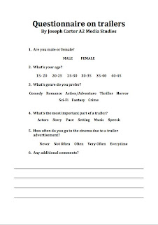
To further develop my understanding of what audiences i should aim the trailer at, i created a questionnaire that i handed out throughout my school and family. I gave it to 36 people and of an equal amount of males and females, so that the test results are fair and are not bias to one sex. The ages ranged from 15 to 45 therefore giving a wider range of results. Below is the questionnaire that i had given out.


Quantitative Results

Question 1


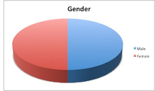
As you can see from the results above there were 50% male participants and 50% female participants. They consisted on 36 participants overall.

Question 2


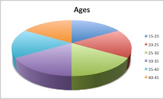
In the above pie chart you can see there is an equal amount of participants in each age section, therefore making the questionnaire more valid and less bias between ages.

Question 3

Overall


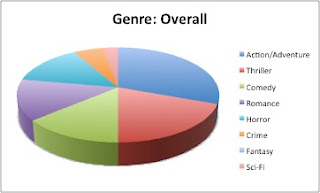
Overall it seemed that Action/Adventure was the most favoured between both sexes showing that the genre of the trailer I'm creating is favoured amongst the general audience of all ages.


Men seemed to favour action/adventure the most with the thriller genre following close behind.


Women most favoured the romance genre, with thriller and action/adventure following close behind.

Question 4


The evidence above shows that due to good trailers being advertised often convinces the public to go and watch the movies often. Showing how big an impact a trailer can make.

Question 5


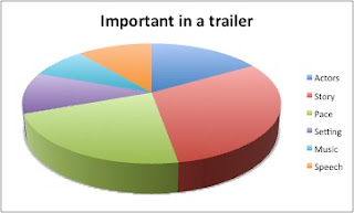
Above we can see that the audience find the storyline and pace in a trailer the most important assets with other attributes such as actors, speech, music and setting following behind.

From this quantitative research, it has affected the way in which i will produce my trailer. The pace was already something i had set in my goals to produced. An effective pace to create a climax throughout the trailer is key when wanting to draw the audience in.
The storyline also seems to be very important when producing a trailer. Showing a successful narrative seems to be key, because if there is no story to a trailer, then it gives the audience no motivation to see the movie. As we can see from question 4, a trailer is very important in contributing to people going to the cinema and watching the full length movie, so pace and narrative are the basis of the trailer i'm going to create.
Action/Adventure seemed to be the favoured genre of all movie genres amongst the people who answered the questionnaire, who represent the audience. A convention of action movies is high pace, so i must make sure that once the pace starts to get faster, it continuously does so throughout, until the end when it comes to a threatening scene which leaves the audience at a cliffhanger.

Tuesday 18 January 2011

Research: Audience Profiling

Through conducting in depth reasearch, many organisations investigate specific details of what audience they want to attract through analysing there tastes such as music interests, sport interests, what age they may be, what was the last film they might of seen, what type of computer games they may play and what TV shows they are interested in.

Because my movie trailer is under the genre of action-thriller, i believe by using audience profiling i am able to get a much clearer view of what type of audience im trying to attract. Below i have created a profile for what a person would be like, who i would target for my movie.

Age: 18-23
Occupation: Student at University
Computer Game Interests: Shooters and FPS
Music Interest: Rock, Hip Hop
TV Show Interest: 24
Last film seen: Taken
Sports interest: Football, Rugby

Below is a picture of the person I am trying to target.

Monday 17 January 2011

Research: Teaser Trailer Research

 Teaser Trailer

The task is create a Teaser Trailer for a new movie, create a magazine front cover based on the movie and a poster for the movie.

A Teaser Trailer: A short trailer that is used to advertise an upcoming film to an audience. They contain short sequences in order to entice the audience to want to see the movie. They are also brief so that the release of this movie is made out to be a big important event.

Conventions are what we usually expect to see in all trailers. Common conventions are listed below.

Conventions of teaser trailers include: 


Titles - These are shown so that the audience know what the film is called, and if the title is produced well within a teaser trailer with good fonts and attractive colours, these titles tend to linger in the audiences mind.

Voice-Over - This is a narrated, non diagetic sound that could represent the protagonist telling a brief outline of his story, or could be part of a scene within the movie itself.

Release date - This is shown so that audience know what time the movie is coming out, therefore bringing more excitement for the coming months towards the movie.

Music - Music is key when incorporating it in to a teaser trailer, as it can aid attributes of the trailer such as the high pace and storyline. The producers must make sure that the music is suitable for the genre of the trailer in order to assist it's effect on the audience. Music within the trailer is usually diagetic.

Pace - This can vary throughout the trailer, usually to stimulate and thrill the audience.

Institutional References - Companies that have produced and distributed the movie are shown to the audience in the trailer.

Below are examples of teaser trailers.


Fast Five


Conventions of Fast Five:  
  • An institution is shown at the beginning of the trailer, showing the audience that the trailer has been approved  for appropriate audiences by the MPAA.
  • A wide shot of Rio De Janeiro is shown, establishing the location of the following events. A caption saying the location is also displayed.
  • The pace starts off slow and as music is introduced it gradually gets louder as the pace becomes more intense. 
  • After the action starts, the institutions who produced the movie are displayed.
  • Voiceovers used while others events are shown, so that the situation can be more fully understood by the audience.
  • Instead of a date, the season Spring is displayed as the release time. 
  • Various title captions are used to excite the audience.
  • Many conventions of the action genre are included such as car chase scenes, guns and explosions.
  • Many cuts to different scenes very quickly in order to keep the pace fast.
  • Movie information is displayed at the end of trailer such as the movie website, production company and where to see the movie. 


Taken


Conventions of Taken:

  • MPAA approval certificate is shown at beginning, to inform the audience they have legal consent to watch the trailer.
  • Movie institutions are shown (20th century fox & Europa) 
  • Pace start off slow, and through different shots of an innocent daughter and gentle diagetic music the equilibrium starts off stable.
  • Music dramatically changes signifying a change to the equilibrium.
  • Two scenes are shown at the same time of a phone call, showing both fearful and nervous expressions of the father and daughters faces. This also helps the audience to understand the situation the protagonist finds himself in. 
  • Fast cuts to different scenes are used in order to create pace in this situation, giving the audience discomfort and tension. 
  • Diagetic music is again changed to give a sense of mystery of who is on the other end of the phone call.
  • One scene is played with it's speech, whilst many flash forwards are quickly flickered in between this scene to show what action is to come.
  • As the phone call is coming to an end a sinister piece of diagetic music starts and gets quicker, giving a sense of panic to the audience.
  • All diagetic music is stopped, in order to give the dramatic effect of the response, which the person on the other end of the phone call says "good luck".
  • Title of movie and director name are displayed whilst a hanging up tone is played, then another, gradually slower breathing sound is used as actors names, the release date and the movie website are all displayed to the audience.
  • The hanging up tone and heavy breathing sound, leaves the audience in tension and wonder of what will happen. Leaving the audience in this cliffhanger state, attracts the audience to want to go and watch the movie, therefore making the aim of the teaser trailer a success. 


Transporter 3

Conventions of Transporter 3:

  • MPAA certification shown at beginning.
  • Opening shot wide shot of paris showing the audience main location of events.
  • Gentle beating music in background to give a seedy pace.
  • Voiceover of a conversation while other scenes are being shown.
  • When the tension of the conversation is at a climax, the scene of the conversation is shown watching the response from the protagonist.
  •  When response is said, all music stops to hear the response clearly, therefore showing the power and confidence that the protagonist has.
  • As fighting starts, music also starts again, this time being a lot more louder and faster therefore increasing pace.
  • After fight scene ends the institutions that produced the movie are shown and music is back to a steady pace.
  • A pedestal wide shot is used to shown the protagonist strapped up and in a dangerous situation.
  • Voiceover is yet again introduced giving the audience more information to understand the situation, while other scenes are being shown, in order for more action to be viewed.
  • The conversation in the voiceover is shown as a scene, and yet again the music is stopped so the protagonist can tell the 'bad guy' "i drive my own car" showing confidence and no fear.
  • Female character is introduced, showing that their may also be a love relationship within the action movie, and seeing that relationship developing through all this high paced events also interests the audience.
  • Steady music yet again introduced, and then ceased when the bad guy' tells the protagonist that if he moves 75 feet from the car he will explode, this effect is useful as it shocks the audience into realising the task the protagonist has to undertake.
  • When fast driving starts, faster music is again introduced to aid the increased pace, thus exciting the audience.
  • A POV (point of view) shot of the car driving fast along the road is shown as well as a closeup of the speed dial, showing the speed in which the protagonist is driving. This is effective as a lot of action movies have high paced car chases, which tend to exhilarate the audience.
  • Music is again stopped when friend of the protagonist creates a joke in response to something the protagonist had said when he states "with you its always complicated".
  • Narrator is introduced and reads out captions being displayed in a deep and clear voice.
  • Release date is mentioned by narrator.
  • Faster and louder music is played as well as more action scenes. The more action scenes shown encourage the audience to go and watch the movie to find out why there is all this action.
  • Narrator reads out more captions in between speeches of characters, telling the audience "do not" "step out" "of the vehicle"therefore the audience is motivated into thinking what if the protagonist does step out the vehicle and does he.
  • Mise en scene shown such as explosions, stunts are shown and fight scenes giving a the genre of the movie a more and more clear defilement that it is action.
  • Narrator reads out main characters name, showing the audience who will be taking on the roll of the protagonist.
  • Around 1:45 all music is ceased, to show a climax to whether or not the protagonist will take the risk in the situation he finds himself in. This scene is then cut to another scene yet again enticing the audience to asking questions such as what will the protagonist do.
  • As car lands on train, title is added to the camera shot and the narrator reads it out. 
  • Last scene of action is shown when protagonist breaks through window to take out bad guys.
  • Music is at a fast and steady pace, it therefore suits all names of institutions and people involved in the production to be shown.
  • Coming soon caption is shown and then comes towards to camera and then fades out to a black image and music is ceased at same time, to show the end of trailer.

Conventions of an action film trailer

Trailer

1. Narrative: The protagonist, involves the audience from his/her point of view which creates a sense of sympathy for the protagonist.

2. Clothing: Typical everyday clothing such as t-shirts, jeans, tracksuits to outfits such as an army outfit or suit.

3. Setting: These can be in any location such as urban, towns, cities or the countryside.

4. Camera Shots: tracking shots are used for high paced scenes.

5. Mise en scene: weapons e.g. guns, knives

6. Themes: Revenge, Heroism

Using many of the above conventions in the trailer, will keep the action genre very much recognised throughout the final cut trailer, therefore the audience will not fail in identifying it. The challenges that will be faced when filming the trailer, is that when using tracking shots, it is hard to keep them stable.


Sunday 16 January 2011

Magazine Editing

Below is the editing i have been doing in order to improve my movie magazine cover. Using photoshop i have been adding titles of the magazine which i have now called 'Film Fanatic'. As you can see below i have gradually added more material and changed some of the fonts and places of the objects on my page. This is not my final product merely adjustments that have been made through creating the magazine. I felt that changing the font of the title was key as in the first editing screenshot the title did not look professional. However using a different font improved my magazine cover as we can see in the second screenshot. As the title is the key factor within any magazine, it must have clarity when being read therefore is believed changing the font was an important factor.


Saturday 15 January 2011

Planning: Photos for Magazine Selection

In order to create a professional looking magazine cover, i took many pictures so that i had a wide variety to choose from. Below i have displayed a few of the photos that i took, which i will choose from in order to incorporate on to the magazine front cover.

1
2
3
4
5

Out of all these photos, i chose number 4 to display on the cover, as the expression on the protagonists face look's very intimidating to whoever looks at it. Therefore when a reader look's at the image they will instantly be engaged by the stare the protagonist appears to be given them. This is a threatening look thus conveying the genre of an action thriller.

Friday 14 January 2011

Planning: Rough Magazine Designs

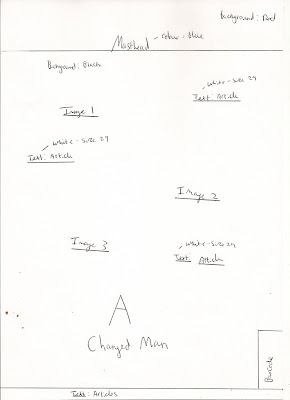
Below are rough designs that i have drawn in order to explore how the final movie magazine cover may look. I used many different layouts and placed images and text in different places to get a better view of what cover would look most professional and stylish according to the genre of the movie. As my movie is based on revenge, the magazine will have to attribute this theme. Below i have mentioned details of where images and text will be placed, the size and colours of the fonts and the background colours.


Thursday 13 January 2011

Research: Magazine Cover Research

Magazine

1. Main character usually takes up most of the page, and they tend to be full bleed covers, showing the main article featured in the magazine.

2. Title of magazine and movie title both in recognisable and distinctive fonts.

3. Sub articles are shown in the smaller part of the magazine (seen at the bottom of the below magazine cover).

4. A caption usually displayed along side the picture, giving brief outline of the exciting new features of the movie.

5. Price, barcode and date of issue shown on front cover.

6. Captions of other articles included in the magazine are shown on the front page.


Conventions of Iron Man 2 Empire magazine:

Empire magazine, shows through one big full bleed photo that the main article featured in this issue is Ironman 2 (Jon Favreau 2010). The bright and vibrant colours of the ironman suit already draw our attention to the picture, as well as the electrifying title. These are very effective as the background is dark and plain therefore the pictures and titles stand out very well. The electrifying title compliments the picture of the ironman suit as it is the same colour as the centre piece of the suit. The title font and colour also conveys that this issue will include movies such as Ironman that are fast paced and intense. The glowing eyes on Ironman also look directly at the audience, giving the character authority and power which suits the genre of the movie itself as an energetic, action packed production. The picture perfectly represents the movie because as a comic hero and a sequel, most of the audience this movie was aimed at would know that character. It would also be well known as the first movie was a success grossing $585,174,222 and had the fourth biggest superhero opening ever. The white title for the article, is bold, simple and it stands out therefore people will know that there is an Ironman sequel and this produces excitement of fans as a result. There is also a caption below the article title which although short, it gives a big impact of whats to come in the new movie "New Suit. New Enemies. Same Attitude.". The full stop effect also creates excitement within the fans as it doesn't give away too much but gives enough to exhilarate the reader. The caption is in a smaller font of the opposite colour in a grey box, but still stands out as the font is black and stands out well. There are also smaller more minor articles within this magazine that are depicted as smaller article titles and pictures, therefore contrasting to the bigger event within this magazine, Ironman 2. 


Conventions of Inception Total Film magazine:

Here we can see FILM magazine, which although does not have as bigger picture that the Ironman 2 one above, is the only image on the front cover, showing again that Inception will be the main article within this magazine. As a psychological thriller the FILM title is filled with pictures of buildings from an aerial view, which makes the audience start to ask questions like what is this movie about. Also above the title of the magazine, a caption is shown saying "The Mind-Blowing Issue" literally making a pun of the psychological movie shown here. Another caption is shown below the "Inception" title saying "Inside The Ultimate Head trip" yet again showing this psychological movie will get in your head. The movie title on the front cover is not the ideal standing out colour but however, if you were to look at it in bright red, it wouldn't look stylish and therefore not very appealing to the audience. The background is effective when making Leonardo DiCaprio stand out to the audience, which is effective as Leonardo DiCaprio is already a very successful actor, so therefore the audience would know this and think it must be a good movie. Apart from making Leonardo DiCaprio stand out the rest of the smaller fonts above the picture just to the right when it says "Re Boot of the year?", these fonts are not very clear and this prevents the reader from capturing what the other articles are about.


Conventions of Star Trek Total Film magazine:

This FILM poster is very simple but very effective. The plain black and white image is a full bleed photo and there is no other main image displayed on the front cover, so that the audience will be able to spot the main article within this issue. The character is looking straight at the reader with an intimidating look, showing his authority and confidence. Although he looks serious, he has a very slight smirk, conveying to the audience that this will be a serious film but will also have a lot of funny and enjoyable moments. The background is plain so that there is no other part of the magazine that you can be distracted by. Another reason it is black and white is so that the bold and big "STAR TREK" title can stand out, and as Star Trek is already a very established and both a successful film and TV series, many people would immediately recognise it. Also in a smaller red coloured font the words "World Exclusive" are shown, therefore creating excitement that this is the first magazine with different information than any other magazine in the world, making fans of the franchise want to read about it. The caption shown below it "The Boldest And Coolest Film Of 2009" and as "coolest" is underlined, it shows that there may be a change in the typical associations with this movie which are that it's only for Sci Fi fans, it also is a big statement coming from a well established magazine such as FILM therefore it must be good. There is plenty of different pieces of text some in red and some in white. They are both effective as they stand out well and clear to the audience so that they can recognise other movies featured within this issue. There is also a mini picture with the caption "4 amazing covers", giving the audience another reason to buy the magazine.

Wednesday 12 January 2011

Poster Editing

Below we can see some of the stages involved when editing my poster for my movie. Through using photoshop and it's tools i have been able to create a template for the photos that will be put in to the poster. I have decided to go with an A3 landscape poster as i believe it will best compliment the product in this format and give it a large space, so it is easy for all audience to see.


Tuesday 11 January 2011

Planning: Photos For Poster Selection

To give myself a wide variety of choice when selecting what image i want to use, i have taken a lot of photographs that will enable me to choose the best one that will be incorporated on to my movie poster. Below i have selected sow of the pictures i have taken. I will choose to use one or two of these pictures on my movie poster.

1
2
3
4
5
6

When reviewing all of these photographs and looking at designs i had created, i decided to use images 3 and 6, as they were each half of the protagonists, also as one was meant to be evil and one good i had a very effective idea that i would incorporate on to my poster. When using both these pictures i will be able to show the theme of revenge and also the separation of Good VS Evil.

Monday 10 January 2011

Planning: Rough Poster Designs

Below are two rough designs i have drawn for my movie poster. I designed both a landscape poster and a portrait one, to see what one looked better. Both designs in their final versions would be printed as A3, therefore making them easy to read by an audience. In the designs i have included sizes on fonts and their colours. I have also included where the text and images may be placed when the product is finished swell as what the background colour will be. This has enabled me to gather a much better view of how the poster will be created.


Sunday 9 January 2011

Research: Poster Research

Poster


1. Large title that includes bold fonts, with a colour that makes it clearly stand out from the rest of the poster, therefore attracting the audiences eye towards the title.

2. The main characters are usually displayed on the poster, showing both the 'Good guys' and 'bad guys'.

3. Dark background colour brings out the brighter colours of the protagonists and the setting.

4. Main characters names are displayed on poster in a smaller font yet in a colour that will make them recognisable.

5. Some mise en scene is shown in the poster, such as explosions, enticing the audience to want to see this action packed movie (as shown below)

6. Poster is simple as although it shows the protagonists and pieces of mise en scene it doesn't give much away about the storyline.

7. A caption that relates to the story of the movie.


As we can see from the movie poster above their are many different conventions that are included in them to attract and intrigue the audience. 

Conventions of the Ironman poster are: 


- The title is bold and the colour helps it to stand out therefore people can easily read and instantly know what the movie is called.
- The smaller font names at the top of the poster are those of actors included in the movie.   Although not as big as the title (purposely not so that attention isn't drawn away from the main title) the names are there for people to see if their favourite actors are starring in the movie.
- The various institutions and producers are shown but in a much more vague and smaller font so that again attention isn't drawn away from the main pictures and title.
- The 'coming soon' is shown at the bottom of the poster in a clear enough format for the audience to see but again is not as attention seeking as the main title. Also as there is no official date, 'coming soon' excites the audience, letting them know that the movie will be in cinemas soon.
- Mise en scene is shown in the poster such as the explosion, the helicopters and the jet planes, showing the movie in packed full of high paced action.
- The various characters are shown, depicting the main characters such as the villains and heroes and what their roles are. We can see Ironman at the top as the biggest picture, which is a recognisable character as he was an already well established comic and cartoon character therefore people are immediately able to relate to the poster.


Conventions of Eagle Eye poster:

- The title is the biggest sized font and is very clear. The colour is also simple and stands out from the black background, making it easier for the audience to see what the movie is called.
- Actors names in red, but in a smaller font. This again makes it easier for the audience to read the names to see if their favourite actors are starring in the movie but as they are smaller they do not steal much attention away from the main title. 
- The caption above the actors names is small and clear, thus not stealing attention away from the main title but when people read the poster in detail, this caption will attract people to wonder about the movie and it's storyline thus them wanting to see the movie.
- Institutions are shown below the title, so if people want to see the producers they can but as it is much smaller, people will concentrate more on objects such as the title, release date, actors and pictures of characters. 
- Release date is simple, bold and clear giving the audience the date when the movie will be released, so they know when they can see it. 
- The website name 'www.eagleeyemovie.com' is shown below the institutions text, so if they audience want to find out more about the movie they can visit the movies website online. 
- Two characters are shown on the front cover, only their faces are shown but many different expressions of their faces are displayed showing signs of panic, fear and seriousness. In the smaller pictures we can see both characters running, also giving us a sense of fast paced action.


Conventions of The Dark Knight poster:

- As the white colouring stands out from the dark background, the title can clearly be read. Also as Batman is a well established 'superhero', the sign behind the title can be recognised by a large audience, therefore a lot of people wont have to read the title but merely see the Batman sign and understand what the movies about.
- The actors names are all shown in a clear colour so they stand out from the dark background, but as they are in a smaller font they do not draw attention from the title or the picture. 
- The institutions are shown to inform the audience what companies produced the movie, who directed it and composed the music etc. 
- The 'www.thedarkknight.com' in shown below the institutions, informing the audience if they wish to find out more, go to the website. This helps to promote the movie more effectively. 
- The release date is the same size as the title, simple and clear. This will inform the audience of when the movie is to be release but as it is so short it will only take the audience a few moments to look at thus not drawing much attention from the rest of the poster.
- The picture is a low angle shot of Batman, showing his authority and power. As he looks very dark and mysterious this gives the audience a sense of wonder about what he will have to do within the movie. 
- The mise en scene around batman of the explosion and fire in the building, show the audience that the movie will have conventional action scenes that will be high paced and destructive. 
- The Batman logo carved in the building with fire, is also easily recognisable by the audience as the Batman sign is well established. So even that one sign can tell a lot of people what movie this is about. 
- The caption at the top of the page tempts the audience as 'a world without rules' implies much high paced action and destruction. This helps setup the excitement of what Batman would do in a situation such as this.

Friday 7 January 2011

Planning: Hardware & Software

In order to produce the trailer, magazine cover and film poster i will have to use various pieces of equipment to produce good quality products. Below is a list of what i will be using and why i have chosen to use it.

                                                                                                              Camera

The Nikon D60 is a very suitable piece of hardware as it is 10.2 megapixels and is therefore able to produce very high quality and detailed photos. It is also a very small and compact SLR camera, so it is easy to carry around and take photos at anytime. With it's small LCD monitor, you are also able to review the photos to make sure that you have the correct shot. Also as it uses digital technology, by using a USB cable, i am easily able to transfer the photos to my computer and they are ready for editing.


Video Camera


The Panasonic SDR-S50 is a very suitable camera for my task as it has an autofocus feature making sure that the video is always clear and not blurred. It also has a 78x optical zoom, thus giving the ability to use various camera shots such as close ups. As it uses an SD card and has a USB port, i will be able to transfer all the recorded data on to my computer that will be ready for editing.


                                                                                                             A Tripod


By using a tripod i will be able to keep my filming stable and level therefore making a more professional looking trailer. The tripod has different levels of height that can be adjusted at all times enabling low angle and high angle shots.


iMovie


 iMovie is a software designed for mac computers. It has many different features that will enable me to do my task. It lets you use features such as slow motion, cropping film, exposure settings, cutting scenes, applying audio to the clips, creating titles and incorporating still photos. It also takes raw footage from the camera and automatically puts the data into an appropriate format so it can be edited. 


Adobe Photoshop CS5


This software has various features that let me edit a photo and create templates for magazine covers and posters. The features include cropping, retouching, cutting objects out of a photo via the magic wand tool and the gradient tool to display different background colours.

Thursday 6 January 2011

Research: Student Trailer, Magazine and Poster Analysis

When researching various trailers from the web, i had to remember that hollywood spends millions on making these trailers and the movies that follow. I thought a more useful research method would be to analyse another students A2 level media products so that i could make a more useful approach and comparison when developing my teaser trailer. Through analysing how they have performed i will be be able to improve my promotional value of the products.

I chose http://enorfmcmanusb.blogspot.com/?zx=d34b482d4c26485b Brendans A2 Media Blog. Although my trailer is a different genre, these products seem to have the same darkness about them which i want to incorporate within my trailer.

Magazine Cover


Strengths

1. Most of the fonts on the page stand out really well as the colours and clarity of them stands out very well against the dark background.
2. Most of the font is red which compliments the picture as it has blood all over the object that the hand is holding. This gives the reader a feel of what genre this production might be, which appears to be horror.
3. The title in the form of the icon stands out very clearly to the reader, informing the reader the title of the magazine.
4. The banners at the top and bottom of the magazine, highlight important stories within the magazine which stand out well therefore enabling the reader to see them clearly.
5. The caption "Tops paranormal activity, by a mile" stands out clearly and compliments the genre of the trailer, as paranormal activity is an already well established horror movie therefore this increases the appeal of the movie.
6. The image is very large and striking due to the blood and the object being held thus causing the reader to look directly at it and wonder what it is about.
7. The 'World Exclusive' icon interests the reader as this magazine has a special inside story to this upcoming movie therefore the reader should buy it if they want to know the most they can about it.

Weaknesses

1. When first looking at the magazine i did not immediatley recognize the title of the magazine due to being draw away by other objects on the page. The title of the magazine cover cannot be clearly seen against the icon and i believe this to be a greta disadvantage to the poster as most magazines have the image and title as the most striking items on a front cover.
2. The font of the title of the movie 'Cardiac Arrest' is not very clear and i don't believe it suits the magazine, therefore giving it a disadvantage.
3. The bottom banner does not properly fit the page as some of the text is cut off.
4. The object that is being held by the hand is not clear even though the title suggests it is a heart, when looking straight at the picture i do not see this clearly.
5. There is a far smaller image in the bottom left hand corner of a hand holding up a DVD, but it's purpose is not identified.


Poster


Strengths

1. The image is very striking which draws the audience in out of interest. The amount of blood used and the way the heart is outstretched by the hand, easily depicts that this is of the horror genre, therefore drawing in the horror fans.
2. The quotes of critics at the top of the poster are effective as they give it a positive score therefore making it more appealing to a wider audience of people.
3. Although there is not much of a background, this image tempts the audience to go and find out what the movie is about.
4. The slogan beneath the main title further reveals part of the movie but not too much. "What happens when you get the heart of a murderer" seems like a fascinating and imaginative statement which invites us to explore what it is about by watching the movie.
5. The institutions are shown at the bottom with clarity but although small they still can be read. They are smaller so that the attention is not drawn away from the image and title of the movie.
6. An age certificate is shown which is appropriate as it looks like a gory film which would be unsuitable for anyone under the age of 15.
7. The title is in a large font therefore attention is drawn to it immediately and not drawn to other objects on the page.

Weaknesses

1. The font used for the main title "Cardiac Arrest" is not very clear nor is it menacing like the rest of the poster suggests. If a viewer of the poster was too look from a distance, i believe they would have trouble reading the title. 
2. All fonts on the page are in the colours of white which i don't find menacing as the storyline suggests.
3. Although the colour of the blood looks realistic, it does not appear to have splattered like real blood, as real blood would pour out into a puddle of blood and not have random spaces of ground in between the blood.
4. The two critical comments at the top should be split apart, as they look as if they have been written by the same critic, which they have not.

Trailer


Strengths

1. The sound effects within the trailer compliment the horror genre therefore giving the audience a more frightful experience which horrors fans will get a thrill out of. The heart beat monitor sound aids the whole theme of the production which is the heart of a murderer. 
2. Not too much is revealed to the audience within the trailer, this is a non linear narrative. Therefore the story is not told but the shots taken clearly show the genre of the trailer and the thrill horror fans will gain from watching it. 
3. Some of the editing effects like the TV becoming fuzzy with the title being portrayed on top of it are very well produced.
4. The shaking of the camera produces fear within the audience as if feels if you are in danger of something bad.

Weaknesses

1. The scream that is produced by the female actor, is not in time with her mouth movements, this may produce doubt within the audience that this will be a professionally produced movie and that it is unrealistic.