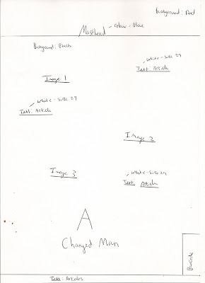
Below are rough designs that i have drawn in order to explore how the final movie magazine cover may look. I used many different layouts and placed images and text in different places to get a better view of what cover would look most professional and stylish according to the genre of the movie. As my movie is based on revenge, the magazine will have to attribute this theme. Below i have mentioned details of where images and text will be placed, the size and colours of the fonts and the background colours.


No comments:
Post a Comment