Poster
1. Large title that includes bold fonts, with a colour that makes it clearly stand out from the rest of the poster, therefore attracting the audiences eye towards the title.
2. The main characters are usually displayed on the poster, showing both the 'Good guys' and 'bad guys'.
3. Dark background colour brings out the brighter colours of the protagonists and the setting.
4. Main characters names are displayed on poster in a smaller font yet in a colour that will make them recognisable.
5. Some mise en scene is shown in the poster, such as explosions, enticing the audience to want to see this action packed movie (as shown below)
6. Poster is simple as although it shows the protagonists and pieces of mise en scene it doesn't give much away about the storyline.
7. A caption that relates to the story of the movie.

As we can see from the movie poster above their are many different conventions that are included in them to attract and intrigue the audience.
Conventions of the Ironman poster are:
- The title is bold and the colour helps it to stand out therefore people can easily read and instantly know what the movie is called.
- The smaller font names at the top of the poster are those of actors included in the movie. Although not as big as the title (purposely not so that attention isn't drawn away from the main title) the names are there for people to see if their favourite actors are starring in the movie.
- The various institutions and producers are shown but in a much more vague and smaller font so that again attention isn't drawn away from the main pictures and title.
- The 'coming soon' is shown at the bottom of the poster in a clear enough format for the audience to see but again is not as attention seeking as the main title. Also as there is no official date, 'coming soon' excites the audience, letting them know that the movie will be in cinemas soon.
- Mise en scene is shown in the poster such as the explosion, the helicopters and the jet planes, showing the movie in packed full of high paced action.
- The various characters are shown, depicting the main characters such as the villains and heroes and what their roles are. We can see Ironman at the top as the biggest picture, which is a recognisable character as he was an already well established comic and cartoon character therefore people are immediately able to relate to the poster.
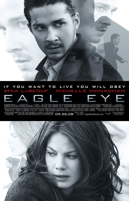
Conventions of Eagle Eye poster:
- The title is the biggest sized font and is very clear. The colour is also simple and stands out from the black background, making it easier for the audience to see what the movie is called.
- Actors names in red, but in a smaller font. This again makes it easier for the audience to read the names to see if their favourite actors are starring in the movie but as they are smaller they do not steal much attention away from the main title.
- The caption above the actors names is small and clear, thus not stealing attention away from the main title but when people read the poster in detail, this caption will attract people to wonder about the movie and it's storyline thus them wanting to see the movie.
- Institutions are shown below the title, so if people want to see the producers they can but as it is much smaller, people will concentrate more on objects such as the title, release date, actors and pictures of characters.
- Release date is simple, bold and clear giving the audience the date when the movie will be released, so they know when they can see it.
- The website name 'www.eagleeyemovie.com' is shown below the institutions text, so if they audience want to find out more about the movie they can visit the movies website online.
- Two characters are shown on the front cover, only their faces are shown but many different expressions of their faces are displayed showing signs of panic, fear and seriousness. In the smaller pictures we can see both characters running, also giving us a sense of fast paced action.

Conventions of The Dark Knight poster:
- As the white colouring stands out from the dark background, the title can clearly be read. Also as Batman is a well established 'superhero', the sign behind the title can be recognised by a large audience, therefore a lot of people wont have to read the title but merely see the Batman sign and understand what the movies about.
- The actors names are all shown in a clear colour so they stand out from the dark background, but as they are in a smaller font they do not draw attention from the title or the picture.
- The institutions are shown to inform the audience what companies produced the movie, who directed it and composed the music etc.
- The 'www.thedarkknight.com' in shown below the institutions, informing the audience if they wish to find out more, go to the website. This helps to promote the movie more effectively.
- The release date is the same size as the title, simple and clear. This will inform the audience of when the movie is to be release but as it is so short it will only take the audience a few moments to look at thus not drawing much attention from the rest of the poster.
- The picture is a low angle shot of Batman, showing his authority and power. As he looks very dark and mysterious this gives the audience a sense of wonder about what he will have to do within the movie.
- The mise en scene around batman of the explosion and fire in the building, show the audience that the movie will have conventional action scenes that will be high paced and destructive.
- The Batman logo carved in the building with fire, is also easily recognisable by the audience as the Batman sign is well established. So even that one sign can tell a lot of people what movie this is about.
- The caption at the top of the page tempts the audience as 'a world without rules' implies much high paced action and destruction. This helps setup the excitement of what Batman would do in a situation such as this.
No comments:
Post a Comment